Showing posts with label ougd201. Show all posts

Tuesday, 22 November 2011

OUGD201 END OF MODULE EVALUATION

What skills have you developed through this module and how effectively do you think you have applied them?
I have learnt how to successfully develop a brand and identity for a concept from scratch and the processes I need to go through to achieve this. From this skill it has meant that my hand skills have greatly improved and my ability to produce thumbnails of logos at speed. My software skills have greatly improved. I am now able to use the Adobe programs in a more professional manner; colours, layout and pre-flight checks. My research ability has improved, I have learnt to think beyond the main subject that I am researching to all the different surrounding subjects (strands of information) that are connected to my ‘good’, hence having a broader understanding and a better ability to develop a successful idea. I have a better skill designing for print and talking to printers; through visiting the printers, Lorenzo’s seminars and producing the Top 10 Manual I have a clear working process and understanding of what you need to consider and know before you even start designing for print e.g. stock, printer type, number of copies, bindings, finishes and costs.

What approaches to/methods of design production have you developed and how have they informed your design development process?
I have a better understanding of the process and elements I need to talk about and plan before I start designing for print. I need to know where I want my design to be, how many copies I need printed, what print process it is going to be printed through, the costs, the stock and the finishes. I have learnt that all of these factors will greatly affect the outcome of your print e.g. the stock can make or break your design, it is one of the most important things to plan before you start designing. I have learnt how to make your concept and rationale watertight; this makes your design process more effective, direct and well planned.

What strengths can you identify in your work and how have/will you capitalize on these?
Through the studio tasks I have learnt to research and evaluate more effectively. Last year relied heavily on information and designs from the Internet but this year the majority of my design for print has comes from various books from the library. This has greatly increased my awareness and knowledge of print and their processes and techniques have really helped my design strategies. My development of branding and Identity have greatly improved, throughout this module I was constantly making changes and improving my brand design and logo until I was completely happy with it and content that my brand was appropriate and accurate at representing my Good. I have really enjoyed every part of this module, I have become really motivated in my work and as a result I am producing a much better quality and quantity of work.

What weaknesses can you identify in your work and how will you address these in the future?
I still feel that the tone of voice and content of my promotional work can be greatly improved. I think that I need to condense the information and make it more appropriate to my target audience. Furthermore, although I had a target audience, I still feel that it was too broad and I constantly need to make reference to who this audience is, where I can target them and how I can make my designs successfully stand out and catch their attention. Although I feel my time management has vastly improved since first year, I still have found that I need to plan daily targets and then evaluate how well I have conformed to these.

Identify five things that you will do differently next time and what do you expect to gain from doing these?
1.     Planning ahead – at the start of the module I didn’t plan ahead enough in relation to what I need to consider before I start designing.
2.     Target audience – although I initially felt that I defined my target audience, I feel that for the next module I need to clearly define this, and how other designers have caught their eye in terms of design materials, language and context.
3.     Resources – I need to make the most of the college resources earlier on in the module e.g. screen print and letter press. I think that this would have provided me with more opportunities and exploitation of print processes.
4.     Time management – this has greatly improved since last year but I feel that I spent too much of my time researching which ate into my designing and process experimentation time.
5.     Blogging – this is another area where I have improved in however I need to make sure that I evaluate and write down every part of my thought process. As a part of the evaluation process, I feel that I need to talk to the tutors more about my work in the studio development sessions.

6.How would you grade yourself on the following areas:
(please indicate using an ‘x’) 

5= excellent, 4 = very good, 3 = good, 2 = average, 1 = poor

1
2
3
4
5
Attendance


x
Punctuality


x
Motivation


x

Commitment


x

Quantity of work produced


x


Quality of work produced


x


Contribution to the group


x


Monday, 21 November 2011

Friday, 18 November 2011

GOOD IS // STICKERS

I have designed two pages of logos - one for each colour of the box designs. I think that from looking at the stickers as a logo on its own, I am very happy with how well it has developed from my initial logo and definitely can be identified with being a logo from the music industry.  


GOOD IS // Packaging Finals

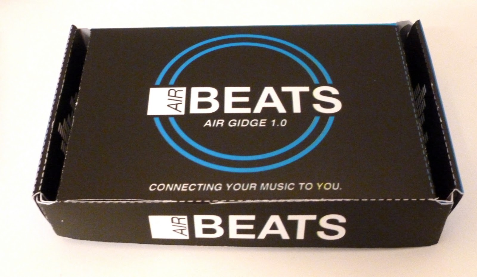
For the final packaging I decided to keep the original blue gradient design, create white, black and a foil stamped version of the net. I felt that the range of the packaging wasn't complete without the blue package. I am pleased with how they have come out and they all look smart and I feel that they would stand out in a music / technology shop such as HMV. I am most pleased with the foil stamped net, I think that it gives the design an extra edge and the shine of the foil will attract peoples attention and make them want to pick the package up, hence a more successful design. 

I would have liked the logo on the foil stamp package to also have been embossed and for the other 3 packaging designs, I would use a UV spot varnish for the logo, to give the design an better quality finish. 


For the foil package, I used the silver for the top / lid and sides, and for the bottom part and sides I used the ice blue, hence incorporating all of the colours. 


GOOD IS // Packaging Nets

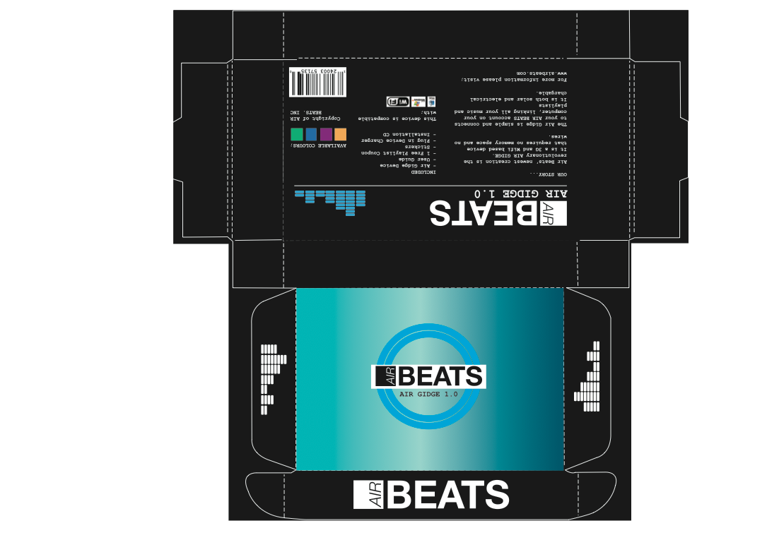
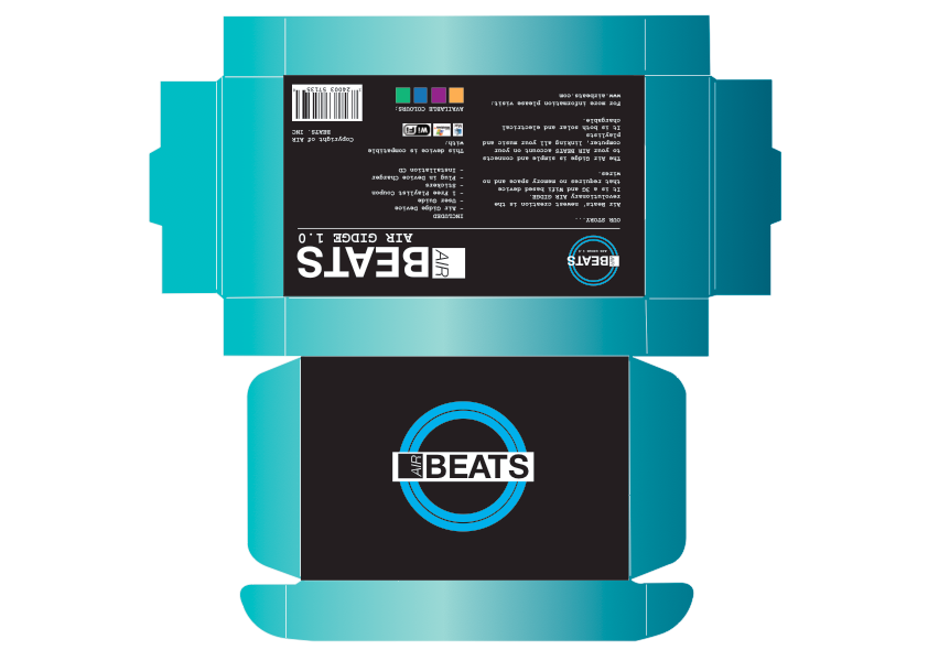
Below are a series of some of the designs I experimented with for type. Some of which I designed to go on black stock, however after testing out what a packaging would look like on black stock and finding that it didn't work how I wanted to, I have decided to print all the nets onto white card, apart from the foil stamped packaging. 

For the final nets they all have the same basic layout, it is just different parts of the packaging are different colours / gradients. 


This is the black net that I am going to use

This is the net for the foil stamped. 

This is one of my original nets that I thought I was going to use, just to test out the different gradients, however after printing out I didn't feel that it fit with the rest of the packages. 

The main gradients


The basic white net - this is the net of the package which people felt from the crit was the better one.


This is the design that is going to be printed on the inside of each of the packages.


A simple packaging design with no colour. 


Using the other developed logo in a white circle. This was one of the designs that I started with. I feel that the filled white circle logo is better than the outline of the white logo (below)


Just experimenting with different colours, but then I felt that it wouldn't' fit with the rest of the designs and that it was better to stick with the blue white and black colour scheme. 


Having the main body of the net as the gradient and the top and bottom of the net as black. I think that it looks better on the net that it would do printed out because I want to keep the top face of the package to be the most striking part of the package rather than the edges. 


GOOD IS // Bus Station Proposal Advert

As well as creating the posters, I want to blow the 3 of them up to fit the space in the bus stop. These would be printed digitally and placed all over the city of Leeds. I propose to print approximately 500 on uncoated paper, with no extra print finishes. 
It is a perfect place for the advert to be seen as one of my target audience for the promotion to be seen by is commuters and public transport users. The Air Gidge is designed for them  - no hastle with wires and they can update their music on the go. As well as commuters and public transport users, it is perfect location for students to see these adverts as they are also regular users of buses in Leeds as well as these advert spaces being visible when they walk to and from University. I think that the blue gradient works really well, it is very different form other bus adverts and would stand out, especially in a lit up bus station at night. 


GOOD IS // Posters Printed Out

These are the final poster that I have printed out. I have printed them on a slight cream coloured stock as I felt that it gave the poster a better effect - especially the central poster, a much softer contrast between the black and the stock colour. 
Overall I am pleased with how they have come out. These are the posters that will be shown in shop windows, cafes, bars, sports halls. I also propose to blow them up in size and place them on bus stop adverts. 


GOOD IS // Poster Design & Rework

Something that was picked up in the final crit was that my posters didn't look as one and part of the same brand as the packaging. I have also used an image of a pair of wireless headphones on the posters because someone is more drawn to look at a promotional poster if there is an image of the product on it. 


I wanted to include an image / icon that would make another link to the fact that this is promoting a music product that is exiting and will improve your musical experience. 


I found that this typeface looked very good for the name of the product - although the issue with this is it doesn't fit with the rest of the brand at all and look like something completely different. I need people to make an immediate link to these poster and the packaging and the rest of the brand. 


This was one of my better designs for the poster but once again the pink takes away the identity of the brand as I haven't been using that.


These were the first versions of the Poster That I have designed. I wanted to use the same gradient for a couple of the posters that I used in the packaging - this way people could make the link. It also has the same logo that is on the front of the packaging.


The background of this doesn't work - here I was just looking at using different background textures and give the feel of different stocks but it isn't bright enough and doesn't fit with the rest of the brand. 


Experiments with simple blue backgrounds - I don't think they work as well as the gradient. 


This was a very different layout and design from the boxed but I think that it looks inters testing and the contrasts of colour will catch people attention. 


I think that the complete black poster looks too much like a music even promotional poster. 


RE-WORK
I have changed these poster and included the logo that I have used on the packaging and changed the type face of the webiste to see if it works and makes the posters connect more with the rest of my designs. I think that it works much better - I have still kept that different typeface the same as the previous poster and I am going to see if this works for a few other designs. 


Although I like the brightness of the blue background - I think the poster looks too basic and wont catch peoples attention if they are just walking by it in a street or bus stop. 


Making the logo larger and on an angle - then re arranging the type so that it is on the right side - doesn't really work as a poster. Looks like any normal advert. 


Changing the icon to blue rather than pink so to keep it more within the brand colour scheme. 


Re-arranging and adding new icons - not a very successful attempt at re-designing. 


3 FINAL POSTERS


Going back to the gradient - it makes the poster much smarter and much more interesting to look at. This is definitely something I want to use. 
I have placed the website link outside the rest of the poster which works much better - keeps the different parts of information separate also works with in the hierarchy of information - I have placed the important information about the product in the centre of the poster. 


I have taken the background colour out and just changed the text about the product to blue - a good contrast and balance of colour throughout the poster. 


A slightly different version of the first poster but just in reverse and here I have placed the text in a black box to try and make it stand out.