
Notes & Ideas


I wanted to use the simple symbols of a beer glass and a cocktail glass to represent the stereotypical drinks for men and women.


My original idea was to have the mail shot shaped in the one of the may different types of glasses for alcohol and have it open up and inside there would be imagery/symbols of the organ affected and statistics about drinking.


A development on from my previous idea (top left corner) was to have a flat mailshot with alcohol glasses which when opened would show the damaging effects on our vital organs.
Another of my ideas was to shock the audience by having a picture of a baby been given alcohol and have the slogan 'they are still your child'.

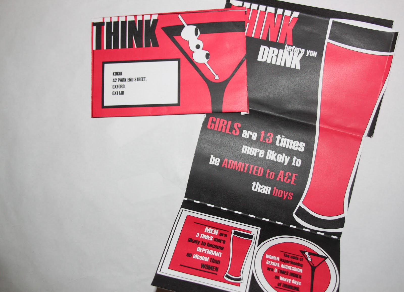
The idea which I used was to have beer mats - one for women and one for men. The slogan on this would be 'think before you drink' then on the back of the beer mats there will be statistics relating to both men and women. I used a circular format for the female beer mat and using my original idea of a cocktail glass as the symbol, and a square format for the mens beer mat with a beer glass.


Designing the format of the mailshot - originally I was just going to have a simple fold up format (see above) however after developing the idea more I wanted to use a large cocktail glass (see below) on the inside of the beer mat and so I felt that having three pages instead of two was better. The beer mats would be on the bottom page and to be cut out and given out when purchasing drinks at bars, pubs and clubs.

TEMPLATES FOR THE SYMBOLS
I experimented with different ways of arranging the colours of white pink and black and felt that when placed on the mail shot; for the cocktail glass it looked better with a black outside and the drink to be pink - also bringing to attention that the alcohol is dangerous. For the beer glass I reversed it slightly as when I used black for the outlining it didn't really work as I would then have to use white as the stock for that side of the mail shot.

THE TEMPLATE FOR THE OUTSIDE

My original idea was to have the beer mats to have a different stock so they were more distinguishable however they worked better with the stock of the whole mail shot if they were the same colour and worked better as a set of beer mats.
THE TEMPLATE FOR THE INSIDE

THE FINAL - OUTSIDE

THE FINAL - INSIDE

MAILING LIST
I chose bars, pubs and clubs local in Leeds and Oxford as I wanted to target student and adults who would use the beer mats.

FINAL RESULT


No comments:
Post a Comment