Tuesday 24 January 2012

Storyboard Booklet

The storyboards are something that I have really found quite challenging throughout this project. For the silent movie brief I found them quite pleasant however for this brief I feel that I was trying to bring too many elemets of festivals together and hence I sat with a slight creative mind block.

I have research a variety of different types of videos; kinetic type, videos created form photoshop edited photographs, handwrendered images and type as image. After watching a series of festival promotion images I became very fixed on trying to create the atmosphere of a festival (similar to the Electric Press Festival Video) but this became a problem because I am more interested in typeography and I found storyboarding for just type in the Silent Movie brief, fairly manageble.

I found that I could have many ideas going around in my head but when I put them down on paper they never got further than 5 frames long, and this is where I would hit a mental blank and then go onto the next idea. So in the end I came out with a variety of different sections of a video - none of which could be linked together and none of which really were hugely relevant to dance / electronic music festivals.
To get through this problem I spoke to Lorraine and she suggested that I listen to my chosen track with my eyes closed and see what I could see at different parts of the track - a different method of idea generation. This actually worked, when I did this I came up with a series of coloured shapes and text moving over the composition. However when I came to drawing these idesas down on paper I felt that they didn't look particularly interesting (which they didn't). However when I put these onto after effects they looked much better. I feel that I had a mental block because all the ideas that I had going on in my head, when they were put down on paper they didn't come out nearly as well as I expected and because of this I got fustraited and started to move onto the next idea.


Open publication - Free publishing - More graphic design

Overall I feel that my story boards appear fairly basic - this is because in reality my sequences are just a collection of simple shapes and words arranged together in such a way and to the beat of the track - this is what makes the difference between on paper and on After effects. I felt that I didn't trust my ideas on paper but I  trusted them more when I had created them in after effects. This is something that for future projects I need to improve on. 

After Effects Workshop 6

Looking at today'
- Additional Key framing
- Grouping
- Audio

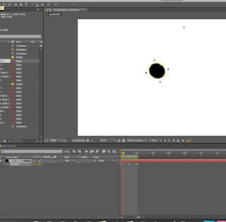
Press 'U' to show all the affects that have been made on the timeline


These squares move at a constant speed. Every keyframe animation we have looked at so far has had a constant speed. In reality, in the non animation world, things don't move at a constant speed. 
Acceleration and Deceleration. We need to be able to work with these to make the movement more realistic. 

We have 4 layers - we are going to apply different speeds to all of them. 

You have to apply the effect to the keyframe - so select / highlight the first keyframe

The movement is refereed to as; easing in and easing out


Applied the 'ease out' effect


The dots are closer together to start with and then become more spaced out. 
When you look at the sequence all together  you will see that all the squares start and end at the same time but they just travel at different speeds. 


You have to have the keyframe movement selected for something a line or movement to show up
The speed monitor is the Y axis

Press Y for changing the anchor point

We are working with Rotation


Simplifying a composition which has many layers

Establishing parent - child relationships
Select the layer which you want to be the PARENT - then all of the other layers will follow as they are the CHILDREN


A child layer can do its own thing but it will still always be bound to the parent layer


YOu can work with groups of layers by NESTING compositions - placing one composition inside another 
At the moment all of our footage layers have just been footage layers e.g. photoshop / illustrator layers. 

If you have your simple composition - instead of grouping the layers of the car together. It is easier to take all the layers and place them in a new composition and then place that back in a new composition (like what Lorraine was talking about last week)

LAYER - PRECOMPOSE (make sure that all the layers you want to put into a new composition are selected


AUDIO
Chose a sound then open it in Quicktimeplayer 7 - export it then save it

when you are exporting to the render queue you have your 3 render options. 
In the output render option which is where you chose your video formats - H264
down the bottom there is A CHECK BOX FOR AUDIO OUTPUT and you have to make sure thaT you CHECK THIS - it isn't turned on by default - otherwise you will have an animation without sound. 

Monday 23 January 2012

Booklet of Visual Stimulous / Vectors and Images to Use


Instead of clogging up my blog with a series of posts about the development / chosen images / typefaces / vectors and information that I have selected to use I have compiled it all into a booklet.

I have chosen to keep the indents very simplistic and use a couple of main images - I feel that the birds eye images of the guy DJ-ing is a very good background image. My original idea when first compiling information and pictures for this project was to have the background of the indents to be fading from bright sun light into a night sky, representing the different stages of the festival.
After trying to story board this and also playing around in after affects I felt that the sky and grass did not link in very well with the festival vibe and instead I was getting too stuck on the global gathering old promo video.

In the booklet there are the collection of photographs which I have cropped and shaped and the ones that I have decided to use in the main video and indents. I feel that out of the large collection of photographs that they are the most representational of the festival.

When starting this project I originally intended to vector a lot of the images that I was going to find then compile them into more of a cartoon piece - but this became too compliated and not actually how I wanted my video to turn out. I also found that I could not vector all the images so I was the left with a vectored and illustrator edited image of a festival tent, with this I then wanted to zoom trough the entrance of the tent and zoom into a huge crowd of people.
However after just placing the different layers on top of each other in illustrator I didn't fell that it looked very good - so I scrapped that idea.

I feel that many of the trails and errors that I have made and scrapped in this project was because I was tyring to bring two many stypes of graphics together - having watched a variety of types of motion graphics, videos and type sequences - I was trying to combine the styles of them all.

My final idea after watching some more music videos and also after talking to Lorraine who suggested listening to the track that I have chosen then closing my eyes and wrighting down what I see at every point - this really helped and I then just started to see coloured shapes. From here I just had a look at how the other music vidoes had involved the use of coloured and black out shapes in a way that wouldn't make them immidiately obvious, then trying to apply this to my work .

Thursday 19 January 2012

Typefaces

One point that was brought up in the crit (when I was still doing all types of music festival) was that I needed to keep the typeface more general. Even though I am now doing dance / electronic music festivals I have been looking a the logos and typefaces of many of the dance festivals out there and they have very clear / general typefaces - not something I would look at and think 'dance music'; like some of the orignal selections of typefaces I wanted to use. I have gone through my font book and chosen a new list which I could possibly use. From this list I will need to also see how well the font will with with images and the soundtrack (Alright - Red Carpet).


Refining my Top 10 & Target Audience

I have been struggling to put together images and ideas for sequences together. My plan was to create 4 indents and a 60 second video on the Top 10 Summer Music Festivals in the UK and Europe. Having talked this thought with Lorraine; the issue with my top 10 is that 'summer music festivals' covers all ranges of music genres; rock, metal, pop, dance, electronic, indie etc. For every different music genre there is a different target audience; a metal music lover would not really be interested in looking at a tv program that was half about pop and electronic music and vica-verca.

New Direction; my main love it dance / house / electronic music so this is what I am going to refine my top 10 to;
"The Top 10 Summer Dance Music Festivals in the UK and Europe"

This refines the target audience and hence the atmosphere and what they would take, experience and hope for from going to a dance music festival.

I am still going to keep the same channel and time of to set the indents to; 1st March 2011 on E4 at 9 PM.
I have chosen this date because it is before the release date of all the tickets for the dance music festivals (some start as early as April) so this will be a look into / guide to what dance music festivals are out there and where they are.

Going to a music festival is more about the experience and listening to music; the camping, mud, rain / sun and lack of sleep are all put at the back of peoples minds when thinking of music festivals. There are always a large range of different characters of people at festivals; some pretty normal and some are highly eccentric, but it is the combination of anyone and everyone coming together with a mutual love of dance music and living for the experience of the music at festivals which makes the festival. People forget about the rain, the mud, the queuing to get in and out of tents and car parks, the lack of sleep, the crowdedness of the tents, the smell of the port-a-loos, the mess of a festival and concentrate more on the music, the dancing, the alcohol, their friends, the people and the whole essence of the adrenalin at a festival.

I have watched a couple of animated videos that have been created about festivals and I think that I have been making my ideas far too complicated. I need to keep it simple, look at all the non-obvious things that makes a festival, get a good sound track and bring together the important information.

Although the theme is 'top 10' this doesn't meant that in the indents I have to name / list / show my chosen top 10 - this can all be in my research but just as long as I can clearly show the target audience what I am presenting then is good. In my story board I have found it difficult to know how top open the  video, but after looking at videos I think that I need to find the music and let that start the video maybe for a second or two (to give atmosphere) and then have images come into focus.

I am going to start finding images that relate and create a festival from the list I have written below;

- tents
- litter
- mud
- rucksacks
- portable chairs
- site entrances
- banners
- railings
- crowds
- stages
- main tents
- lights
- strobes
- horns
- whistles
- bouncing balls
- strange decoration
- fancy dress
- glow sticks
- bright clothing / rave gear
- wellys
- hats
- arms in the air (in crowds)
- fields
- trees
- sun
- rain
- sunglasses
- alcohol
- queueing
- DJ's
- Artists
- Moshpits
- Beaches
- Daytime
- Nighttime
- suncream
- shorts
- plane / car / bus / train
- strangers
- strange people
- no sleep
- sunset
- adrenalin


TYPE Session 2

Q and R are the most identifiable key characters in a typeface - and when creating a typeface this is where you can 'create' the most in.
The detail in every typeface is different. When you select the typeface that you want to work with - then enjoy this process.

When we chose a typeface we are selecting the tone of voice for the message and also how the message is going to come across.
As a graphic designer the main thing to do is to describe a brandname - e.g. say something about what you are saying - so essentially you should be able to tell a lot about a company from the typefaces that they have chosen to use in their brand name.

Exercise - with your chosen typeface - think of a product and a brand name that you would represent using the typeface.


Then think of a brand-name that will be completely wrong for the typeface you have chosen


Also changing the case of the typefaces


EXERCISE - PRESS COPY

First thing to look at is the;
- Hierarchy of information - put a number on each of them to order them


For next week - In type journal

Based on this exercise; find 6 Brand-names; analyse the type in terms of utilising them; construction size, weight, case. An analysis of why this typefaces and characters suit this brand; is it corporate large etc or is it small, friendly and family based. Also if you see a bad brand name etc then take a photo of that as well and talk about why it is / isn't. 
The type journal is something you can start to talk about what a piece of type is communicating - what does it say about them. 


TYPEFACES

 OLD SELECTION OF TYPEFACE


Before I changed and refined my project to just dance music festivals these were a couple of the typefaces that I chose to use these typefaces. I was more intersted in using the STRANSUN - REGULAR because I felt it was the most representative of electro music however I dont think that it is very legible and the formations of the V and A are not hugely clear and I feel that if the word was only going to be up on screen then the audience would be concentrating more on trying firgure out what the text says rather than actualy reading it - especially in the indents that are only 10 seconds long so the text would ultimately not be on the screen for longer than 2-3 seconds, so the typefaces needs to be as readable and legible as possible

This is one of the many flyers that I have always loved the layout / typeface and colours for. Even without reading the text you can tell that it is a dub / drum and bass music night. This is what I was looking for in trying to represent trough the colours and typefaces. I like the slightly distorted appearance of the typeface so I found a couple more typefaces (below) that had this appearance. It is also the backgorund of the flyer that puts the text into context and also reflects the distorted and slightly 'shady' look of the type. 


NEW SELECTION

Bebas Neue was my first choice in type because it is legible but also what one could connect to music (electro) however because I wanted to have the slightly distorted view on the typeface I wanted to find something more suited. I found BASE 02 which I felt was exactly what I wanted. However when Placing it in some of the video with images I felt that although the distorted look was something that I was aiming for, it also reduce the readability of the text. This is the same for NOWARHOUSE - I thought that it was slightly edgy and represented the night / partying / muisc festivals perfectly - however some of the characters are more legible and readable than others. 'Big Chill' For example, the bottom of the B, B and C have been cut off making the name of the festival pretty hard to read - especially if it was just appearing on screen quickly. 

Below are images where I have use the two typefaces in the tester videos. I feel that the BASE 02 typefaces works for the time and date of the program as thankfully all the characters being used are legibl. 


Also for the tester video I used the same typeface - although I feel that it looks OK, it is not clear enough for the title page about the program and needs to be clearer. I don't feel that this typeface is BOLD enough to represent the whole ident / title sequence, it needs to be clearer / crisper.


I used this typeface in one of my tester videos, I thought that it would look good and visible but when looking back trough it, the exaggerated distortion doesn't do any wonders for the ident - I think that moving away from the 'distorted' feel would be wise. Also referring back to the Metropolis flyer - even though the typefaces gives a slightly distorted feel, if you look closely all of the character are fully formed and visible. 


I have chosen to use the BABAS NEUE typeface; it is modern, clear and still fits very well with the electro music theme to my indents and especially works with the blue background and the black box around the text.