Thursday, 29 September 2011

LOGO WORKSHOP - Fred

NOTES
  • Between 1st and 2nd year, students dont think visually throughout the summer and haven't spent time owrking on it. 
  • As a designer, every decision is made based on how it looks visually e.g. trials, tests and visual experience
  • The idea of this project is to try and break any fixed views.
  • It is not about just an idea or just developing a concept, it is a bout CONSISTENTLY reviewing all of it and constantly reviewing your work
WORKSHOP EXERCISE
  • Today was about translating what our 'GOOD' was, into a brand by generating a logo
  • BRANDING & IDENTITY - make sure which directions the client wants to go for
  • LOGO; part of a brand
4 MAIN GRAPHIC ELEMENTS 
  1. COLOUR
  2. TYPEFACE/LETTERFORM
  3. IMAGE/SYMBOL
  4. WORD
  5. SHAPE (in additional to image)
These are the elements which every logo is designed around
The task we had to do today was to fold our sheet of paper into 32 pieces, in ever folded box we had to draw a logo. 
There were 3 parts to the exercise;
  1. Draw 32 logos that visually represent the your GOOD - think about the letterform etc
  2. Chose one world and visually represent it just through letterforms (8 logos)
  3. Chose one letter from the word and represent it in the format our chosen logos have been formed
  4. Visually represent your 'GOOD' through just image
The aim of this exercise was to get quick responses and formations of logos, to bash out our different ideas quickly and produce a huge number of ideas and formations. 


I found that it was a very productive exercise although I did not fully understand what I was doing at the start, and miss-interpreted 'visual representation' of the letterforms and thought it was meant to be more based around image. After I understood what I was doing I found it more effective. Producing the vast numbers of logos at speed was quite problematic. I did not complete the 32 in the specific time period, although for the other exercises I 

Wednesday, 28 September 2011

"GOOD IS..." // 9 BRANDS/IDENTITY/LOGO's -

The task from the workshop we had this morning was from the each of the 5 answers per question about our "GOOD", we had to select the best one of each. With these, we have to find an IDENTITY/BRAND/LOGO for each;

WHAT MAKES IT GOOD // 'CUSTOMISING MUSIC TASTES TOGETHER' = APPLE


Apple is one of the largest and most famous Companies in the world, its branding it one of the easliest recognised, this is to the help of the huge scale sales of the ipod. The logo is of an apple while the identity of the brand e.g. ipod is white earphones, with sleek and elegant designs.


WHO WOULD FIND IT GOOD? // RUNNERS = NIKE
Famous logo of the Tick, anywhere this is placed it is recognised, along with the typeface. Sports brands, associated with trainers (running trainers)


WHO WOULDN'T FIND IT GOOD? //ELDERLY - 'FRIENDS OF THE ELDERLY'


WHAT IS IT BETTER THAN? // DANGEROUS 'FLICKING' OF MUSIC - 

For this, because flicking of music and using and ipod etc is not illegal or come up as an public issue (unlike using a mobile phone), I have instead focusing on concentration whilst driving, no distractions and also using a phone wile driving. 


WHAT PROFESSION WOULD IT BE? // RADIO DJ'S - RADIO 1


WHICH CELEB WOULD IT BE? // ANNIE MAC


WHAT PLACE WOULD IT BE? // NIGHT CLUBS, OXFORD - CLEMS


WHAT EVENT WOULD IT BE? // CREAMFIELDS, 2011


WHAT PRODUCT WOULD IT BE? // ONLINE DOWNLOADS - ITUNES


Old Logo

New logo


WHAT IS GOOD - WORKSHOP

This is about identifying gaps in the concept and ideas on how to move forward and how to generate ideas.
It is our job as a graphic designer to take a concept, proposition etc and to plant a seed that the audence you are targeting, cant live with out
Make sure you cant be questioned, that there aren't any holes.
It is our job to SHOW why it is good, and better than everything else
This exercise/project is about solving a problem through print

WHY - BE SPECIFIC AND ALWAYS CLAIFY WHY YOU HAVE CHOSEN THE ANSWER/CONCEPT ETC  YOU THAT YOU DID

BE SPECIFIC - FOCUS IS GOING TO BE KEY, THE MORE FOCUSED AND SPECIFIC YOU CAN BE, THE EASIER IT WILL BE TO REALISE IF IT IS GOING TO WORK OR NOT. e.g. Amsterdam is good because of the canals and boats etc

WHAT MAKES IT GOOD?

  1. Customised/selected according to personal taste
  2. Range of Genres
  3. Safer when driving
  4. Easier - don't have to change the tape/CD/vinyl/artist/track
  5. Mood/Situation - different types of music collections are pre-mare according to different situations e.g. Party, Chillout, Working
WHO YOU FIND IT GOOD?
  1. Population who have a interest and passion in music
  2. Runners
  3. 10-50 year olds
  4. Drivers; it is dangerous to drive and keep selecting new tracks
  5. ?
WHO WOULDN'T FIND IT GOOD
  1. Non-music lovers
  2. Different characters, a friend who doesnt have the same taste in music as you and wouldn't enjoy the same collection as you, they are personal
  3. Consistency lovers
  4. Business men/women who dont have time or interest
  5. Elderly, havn't been brought up with a collection, range, opportunity to have ipods, cd's etc
WHAT IS IT BETTER THAN, AND WHY?
  1. CD albums - buying an artists album, it is garenteed that you are not going to like every song on there equally
  2. CD mixes e.g. the Now CDs; you won't like all the songs on it, it is a general collection for the public not a personalised collection
  3. Large unorganised - small personalised collections of music e.g. Playlists is easier to select, chose music rather than having large music library
  4. Dangerous Flicking - pre-made playlists/mix tapes are safer for driving as 'flicking' is more dangerous than talking on the phone
  5. Wasting time - premade collections of music save time/energy everyday if your prefered choice in music is already at arms reach
IF YOUR GOOD WAS A PROFESSION, WHAT WOULD IT BE?
  1. music store owners
  2. music producers
  3. DJs (famous and on radio)
  4. Fitness Instructor
  5. Mixtape/CD collection seletors e.g. for the Now CD's
  6. Movie music selectors - music influences movement, good music in a film makes it even better
IF YOUR GOOD WAS A CELEB, WHO WOULD IT BE?
  1. Annie Max
  2. Pete Tong
  3. Simon Cowel
  4. Judge Jules
  5. Annie Nightingale
  6. Netsky
  7. Jaguar Skills
IF YOUR GOOD WAS A PLACE, WHERE WOULD IT BE?
  1. Nightclubs in Leeds
  2. Your Gym
  3. Festivals
  4. Your Car
  5. Bedroom
IF YOUR GOOD WAS AN EVENT, WHAT WOULD IT BE?
  1. Festival
  2. Bed - after a long hard day, you have a playlist to relax to
  3. Socialising with friends whilst preparing to go out on a Friday night
  4. Creamfields 2011
  5. Daily trips to the Gym
  6. Big nights out e.g. Hospitality at the 02 Academy, Leeds
IF YOUR GOOD WAS A PRODUCT, WHAT WOULD IT BE?
  1. online downloading
  2. CD
  3. Book - 'how to create the best playlist for each situation
  4. Ipods with pre-made collections which you can add too
  5. Vintage collections of Vinyl's - auction, a collectors item. 
  6. Celebs music playlists - sell them

CHOSEN 9 ANSWERS
  1. customised according to personal taste
  2. runners
  3. the elderly generation - 70 years and above
  4. Dangerous 'flicking'
  5. Radio DJ's
  6. Annie Mac
  7. Nigh Clubs - Leeds
  8. Creamfields 2011
  9. Online downloads - sell Celebs playlists


TASK
For tomorrow 9.30, you should have your more focused, refined version of GOOD based on this development exercise in the worshop today. A more focused concept is easier to make decisions on what is going to work and what isnt. 
For the 9 chosen answers to each section, find an identity/brand/logo which relates to your answer. 


Tuesday, 27 September 2011

AT THE PRINTERS - Lorenzo's Lecture

COMMERCIAL PRINT


The processes are; PRACTICAL, TECHNICAL, ECONOMICAL
e.g. Rotary, Digital, Screen, Pad Printing


Reper Graphics - preparing the set up to prepaire to print - take artwork, checks the colour, position and technical issues
That then goes to the prink making to create the finished product


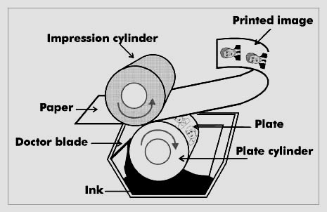
LITHO PRINTING - Rotary - SMALLER, but QUALITY job e.g. leaflets, mailshots, comics etc


  • It is a ROTARY type of printing - it goes round, The image printing places are wrapped around the cyliners
  • Printed fed onto sheet/roll
  • There are 3 types
    • Offset Lithography
    • Rotogravure
    • Flexography
  • The sheets are etched - chemical process
  • some places have DTP - meaning there are no sheets involved
  • PDF goes straight to the plate
  • Made sure BEFORE it goes to the plate that you check and get all the information right because if you notice after it will be a very expensive mistake, this is called the PROOF PROCESS
  • a big proportion of the job cost is simply just setting up the equipment/machines, which can take up to half a day/whole day
  • examples of this kind of print; 

WEB OFFSET - big version of Litho e.g. Newspapers


  • increadibly high speed and runs on rolls of material as opposed to sheet fed.
  • they often have the finish/folding/cut out etc included in the machine process 
RETROGRAVURE (GRAVURE) - Mass Production


  • Much more sturdy plate - so can produce more and the relief is deeper so the product is more durable 
  • hold more ink 
  • copper plates with mirror image so that it goes straight from PLATE to PAGE
  • Typical GRAVURE print = lino print floor which are high volume and durable
  • Its really to do with the NUMBER = high number produced and the products last for a long time
FLEXOGRAPHY (FLEXO) - for PACKAGING


  • It is a POSITIVE mirror image rubber polymer plate, on a cylinder
  • Rubber plate, 2 mm raised, can feel the relief
  • The quality ISN'T as good as the litho print
  • Prints = crisps, cellophane, stretchy material
  • silicon feel, usually roll feed
RECAP
  • LITHOGRAPHY (LITHO) = PLANOGRAPHIC - aluminium plate
  • ROTOGRAVURE (GRAVURE) = INTAGLIO - copper plate
  • FLEXOGRAPHY (FLEXO) = RELIEF - rubber plate

DIGITAL PRINTING e.g. BILLBOARDS


  • The reproduction of image by translating the digital code direct from a computer to a material without intermediate physical process
  • You have to consider; material its printed on to, the ink, the layout
  • You are completely in charge of this every step of the way UNLIKE all the other processes of printing
  • e.g. you collect printer, you can do a MOCK UP and show examples of work before sending it to print
  • 'R.I.P' - 'RASTA IMAGE PROCESSOR' - it takes the computer code and works it out according to the certain printer
  • Digital printing is IDEAL suited to short run/specials on a range of print media from paper to material. 
SCREEN PRINTING e.g. T-SHIRTS (quality and durable)


  • Printing technique which uses WOVEN blocks
  • Hand or Mechanical
  • Mechanical process - each screen has a different colour on it, the number of screens depends on the number of colours going onto the product
  • ROTARY SCREEN PRINTING - the results are really durable
  • The DIGITAL printing has taken over SCREEN printing

COLOUR SYSTEMS

SUBTRACTIVE COLOUR - Ink
  • The more colour you lay on top, the less light is reflected (darker) so the colours are subtracted and it becomes dark
ADDITATIVE COLOUR - Screen
  • The reverse of subtractive colour, the MORE colour you mix together, the lighter it becomes until it is white

VISIBLE GAMUT 


This is all the colours in the world on a spectrum, there are many more colours that we see on screen but we cant print them
Look at the comparisons of RGB to CMYK


ARTWORK, COLOUR MODELS, LIMITATION

DEFINITIONS

CMYK (cyan/magenta/yellow/key black – 4 colour process) Subtractive.
This is used in the most common printed process called litho or offset litho RGB (red/green/blue – screen based) Additive.
Greyscale (Black and white continuous tone and any shade of grey, such as a black and white photograph)
Duotone (when a continuous tone image is printed in 2 or more spot colours – this term is also generally used when describing tri and quadtones.
Spot colour (one or more specially mixed colours as opposed as a result of a CMYK or RGB mix)
Mono (like greyscale but with a coloured ink, ie: one colour and percentage tints of that colour, plus the colour of the material it’s printed on


USEFUL LINKS

LITHO PRINTING
http://www.youtube.com/watch?v=XUlBueqStg4PAZZAZ RANT
http://www.youtube.com/watch?v=VpAuDrs5ocgPAD PRINT
http://www.pdsconsulting.co.uk/2007/Library/Printing_Pad.asp
http://www.youtube.com/watch?v=RlypyjjLDZI&feature=related

SCREEN PRINT
http://www.youtube.com/watch?v=YFM_tBfyjM0http://www.youtube.com/ watch?v=i3iY21z8qLQ&feature=related

COLOUR http://www.youtube.com/watch?v=059-0wrJpAU&feature=relmfu CMYK and printing http://www.youtube.com/watch?v=TUd4r5olX1Q&feature=related http://www.youtube.com/watch?v=8cOZv4AF4pc&feature=related CMYK v RGB http://www.youtube.com/watch?v=fNisT6ROdUo&feature=related RICH BLACK Vs NORMAL http://marvin.mrtoads.com/richblack_vs_plainblack.html
ABOUT PANTONE http://www.youtube.com/watch?gl=NL&hl=nl&v=l6r_CK0rNlk ABOUT COLOUR MATCHING http://www.youtube.com/watch?v=Pz3AMwRJiRw&feature=related COLOUR MODELS
http://www.sketchpad.net/basics4.htmhttp://www.devx.com/projectcool/ Article/19954

MAC SEMINAR - ILLUSTRATOR

Main focus is working with colour and the appropriate colour systems and working with Commercial Print

First thing you check when you open ILLUSTRATOR is to check the colour mode - always have it in CMYK - these are the PROCESS colours
The reasons for this is because the majority of the colours can be printed with different mixtures/% of these 4 colours (all done through halftone/dots)

Selecting and filling a shape with a colour
  • SELECT OBJECT - DOUBLE CLICK FILL BOX - SELECT COLOUR
  • WINDOWS - SWATCHES - SELECT COLOUR
  • CYMK SELECTOR - MIX YOUR COLOUR

The best way to apply a colour repeatedly is to use the SWATCHES pallet (windows, swatches)
We need to be able to build and use our own swatch pallet instead of just using the colours already available

  • Empty the existing swatch pallet by deleting the existing ones  (shift, select = delete selection of swatches)
  • OR - 'select all unused swatches' then delete
  • 'REGISTRATION' key - if you click then if fill with black, it is a 'pure and rich' - this is used JUST for print marks - they are used in the printing process on the outside - you need to register exactly where to print in the right place e.g. screen printing. These marks do exactly the same thing in the commercial print process
  • Colour swatch menu (right hand side) - CREATE NEW SWATCH, then create/mix your colour. The swatch name is just made up of the %'s (better to leave this as the name rather than 'orange')


  • or you could just 'CREATE NEW SWATCH' by clicking the menu of the swatch tab
VIEWING THE SWATCHES IN A DIFFERENT WAY
  • if you hold the mouse over the swatch, it will tell you the %'s of the balance of colour
  • change the view - change from thumbnails to LIST VIEW


ADD USED COLOUR - create a swatch pallet that you have used before


Some of the swatches have a grey box and some don't


You can edit a swatch by double clicking on it. The difference is the DISPLAY, if the GLOBAL box is checked - 'create new swatch' doesn't have the box checked

GLOBAL - it is to do with how the colour works when it is applied to the art work. If you chance the % of a global colour (click preview) - every shape which has that colour will be changed/affected. Just by editing the swatch you can change the colour of the whole thing. For example you could create a very complex piece of art, but  you then decicide that you dont like the shade of yellow for all of it, you can just change it all rather than having to go back through the stages. 
If you dont have 'global' clicked, then there is no link with the other shapes which have the colour selected. 

You can change the TINT of the colour


Then still click on the swatch but then go the the swatch menu again and click 'add new swatch' which will also help when working with a complicated piece of artwork. 


SPOT COLOURS

  • This is a SINGLE colour (previous colours we have been looking at is made up of % of the CMYK colours. 
  • A spot colour is a colour that is applied from its own printing plate, it is a ready mixed ink 
  • e.g. when you are screen printing and you apply a colour, you are applying a spot colour
  • singular, ready-mixed in which is applied using its own printing plate
  • The circumstances when you would use a spot colour is; when you want to print a colour that is not produced through the CMYK colour scheme e.g. FLUORESCENT colours, metallic inks, vanishes, glues, also because of COST (e.g. 2 colour print job is cheaper to produce)
  • If you use CMYK = 4 printing plates, so if you use a 2 colour print job (2 printing plates) then the cost of the job is going to be MUCH cheaper. 
  • Use of spot colours as well as CMYK will INCREASE cost, as as well as having the 4 plates you then have to have an additional plate for every spot colour, so at the same time as reducing the cost, in some cases the price can extrememly high
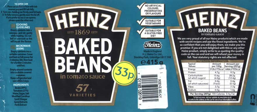
  • CORPORATE/BRAND COLOUR - use of spot colour e.g. HEINZE beans, so the colour is always exactly the same - you can then ensure there is NO deviation of the colour throughout each reproduction. 


If you use SPOT colours in the shell logo - the colours can be defined by using a REFERENCE, so they each have a unique reference number, the company can tell you the reference number of the exact red so you can ensure when designing that you use the EXACT red they require. 

SPOT COLOURS & BOOKS
  • another place where spot colours are in SWATCH BOOKS
  • different books for different types; metallic, paper type
  • each one of the swatches/blocks of colour are identified by the UNIQUE reference number

USING THIS IN ILLUSTRATOR


Most of the colours in here are ADDITIONAL CMYK swatches


  • The above list is the colour swatches that we are intersted in. The SOLID ones are the ones we have in books
  • When talking to printer about what you want to produce, you would discuss the type of paper you would use, and you would also talk about the spot colour from the appropriate swatch library/book they were going to use

If you hover the mouse over the colour then you are given the number/name of the colour. It is also more useful to change the view to LIST again, so you have the name/number/thumbnail at the same time


Then click on the same menu bar and click on 'SHOW FIND FIELD' so you can easily search the colour you want


Then to add the colour you want to your swatch pallet you just CLICK ONCE and it will be added. 
With SPOT colours you CANT change the name of the colour otherwise you will lose the name/reference of the colour and the PRINTERS will not understand/have the same reference you have

This indicates to us that it is a SPOT colour


As well as applying tints to a GLOBAL colour you can also apply tints of SPOT colours, just do the same thing but remember to ADD SWATCH


If you use SPOT colours, the only way to have PROOF of spot colour is to use the COMMERCIAL PRINT PROCESS e.g. if you print on a laser printer it will not pick it up as they do not print spot colours, so it will be converted into CMYK, this still happens in the DIGITAL print dungon. Most of the time the replacements will be colour accurate but this is not always garenteed. The only way to have it printer proof is to get it printed by the printer - this is the only way to have assurance that they will print like it does looking in the book

PROOFING IS AN ISSUE which is why we have the pantone colour and spot colour reference system.

SAVING PALLET

once you close the document but want to save the pallet e.g you do a job for a client every 6 months, so you want to save the pallet so you can access it any time...
A new illustrator document will not have your customised swatch pallet

SAVE SWATCH AS 'AI'

It will be saved in the home folder - so which ever computer you log onto it will be avaialbe


To access the saved swatch you go to the same point where you accessed the colour books on swatch library...it will be at the bottom
Or save it onto your home folder or desktop which can be easier to navigate to. 


SAVING IN 'ASE' FORMAT
  • this means your swatch pallet will be available in PHOTOSHOP and INDESIGN, you can transfer the swatch pallet in between programs
  • A message will come up 'swatches containing gradients, patterns, tints will not be visible' - so will will get spot colours and CMYK colours but none of the % of colours/tints
WHEN PRINTING

  • SEPERATIONS - individual positive colours are called this. Each colour/ink would be represented by black/white (greyscale)
  • this creates 5 printing plates (like in screen printing)


If you did that then you would get 5 black and white prints, one for each colours. 


DEFINITIONS

  • PROCESS COLOURS - a process colour is printed using a combination of four standart process inks (CMYK). By defult, Illustrator defines new swatches as process colours
  • GLOBAL PROCESS COLOURS - a global colour is automaatically updated throughout your arotwork when you edit it. All spot colours are global  or local. This will have the icon next to it. 
  • SPOT COLOURS - this is a pre mixed colour that is used instead of or in addition to CYMK process inks. You can identify spot colours swatches by the spot colour icon.