

Before I changed and refined my project to just dance music festivals these were a couple of the typefaces that I chose to use these typefaces. I was more intersted in using the STRANSUN - REGULAR because I felt it was the most representative of electro music however I dont think that it is very legible and the formations of the V and A are not hugely clear and I feel that if the word was only going to be up on screen then the audience would be concentrating more on trying firgure out what the text says rather than actualy reading it - especially in the indents that are only 10 seconds long so the text would ultimately not be on the screen for longer than 2-3 seconds, so the typefaces needs to be as readable and legible as possible

This is one of the many flyers that I have always loved the layout / typeface and colours for. Even without reading the text you can tell that it is a dub / drum and bass music night. This is what I was looking for in trying to represent trough the colours and typefaces. I like the slightly distorted appearance of the typeface so I found a couple more typefaces (below) that had this appearance. It is also the backgorund of the flyer that puts the text into context and also reflects the distorted and slightly 'shady' look of the type.

Bebas Neue was my first choice in type because it is legible but also what one could connect to music (electro) however because I wanted to have the slightly distorted view on the typeface I wanted to find something more suited. I found BASE 02 which I felt was exactly what I wanted. However when Placing it in some of the video with images I felt that although the distorted look was something that I was aiming for, it also reduce the readability of the text. This is the same for NOWARHOUSE - I thought that it was slightly edgy and represented the night / partying / muisc festivals perfectly - however some of the characters are more legible and readable than others. 'Big Chill' For example, the bottom of the B, B and C have been cut off making the name of the festival pretty hard to read - especially if it was just appearing on screen quickly.
Below are images where I have use the two typefaces in the tester videos. I feel that the BASE 02 typefaces works for the time and date of the program as thankfully all the characters being used are legibl.


Also for the tester video I used the same typeface - although I feel that it looks OK, it is not clear enough for the title page about the program and needs to be clearer. I don't feel that this typeface is BOLD enough to represent the whole ident / title sequence, it needs to be clearer / crisper.


I used this typeface in one of my tester videos, I thought that it would look good and visible but when looking back trough it, the exaggerated distortion doesn't do any wonders for the ident - I think that moving away from the 'distorted' feel would be wise. Also referring back to the Metropolis flyer - even though the typefaces gives a slightly distorted feel, if you look closely all of the character are fully formed and visible.
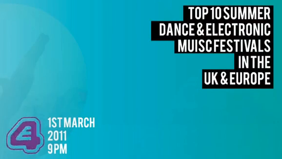
I have chosen to use the BABAS NEUE typeface; it is modern, clear and still fits very well with the electro music theme to my indents and especially works with the blue background and the black box around the text.
No comments:
Post a Comment