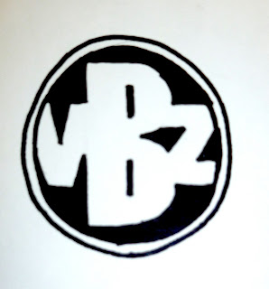
Carrying on from the Logo design workshop with Fred, I have to produce a collection of 150 logo designs which combine 2 of the 3 elements of logo design
WORD
LETTERFORM
SYMBOL
From the exercise where we had to visualise the word - I now have 32 words to work from
What I need to consider
- To have different distinct ideas
- The designs have to be hand rendered
- 1 colour - monochrome - 3 different sized pens
- A6 format (148 by 105 mm, 5.8 by 4.1 inch)
- The images should be drawn so that they can be scanned into illustrator
- The logos have to act as an identity for my GOOD (organised & personalised music collections)
MY THOUGHTS
I found this exercise particularly challenging not just because of the sheer number of logos that we had been asked to produce, but generating different ideas and using hand skills to design them.
I found that as I went on I started to drift away from the themes and words that I was meant to be using and instead I went down along the route of 'music'. Overall, as I got into the process of drawing the different logos it became less strenuous and I began to get in the rhythm of things, but then I would get to a point where I had developed a logo so much that I would have to change and find a new idea, this is where I got stuck.
Overall I did enjoy this exercise, it was a good chance to get back to the basics of designing by hand rather than using the computer. There is a noticeable difference between some of these logos and some of the logo's which I produced in the workshop - my hand skills are greatly improved.
This is an example of the page where I began to get a bit off track with the themes I was using.
This is the page which I think shows the most variations, I had taken the route of music and the vibrations/feeling that they produced then trying to portray this using text.


No comments:
Post a Comment