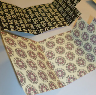
Overall I feel there is a lot of room for improvement for these designs. I think that the colour needs work because at the moment because of the pink it is more targeting a female audience.
The logo is not strong enough as well as the brand name. I am not very happy with it and will spend time re-working the whole brand and its identity to create something that relates more to music and a brand name that commuincates more about what the GOOD is about.
I do feel that using the repetition of the brand name on the inside of the packaging is good and I will continue to use this in the project.
Like the other designs I also feel that there is a lot of room for improvement. The stock I chose was slightly creamed coloured and this has made the black look slightly off. I think if i was to re print these I would use a crisp white stock so to get the best and the brightness out of the colours, especially with the contrasts of black and white.
Although you can tell that all these designs fit together and are part of the same brand, I don't feel they are successful as a piece of design itself and don't grab the attention of my target audience. Although from the feedback crit, it was said that they chose the logo because of the image - I think that this is the part of the logo that is holding me back in terms of development, I think that the shape and design of it itself is limiting.


No comments:
Post a Comment