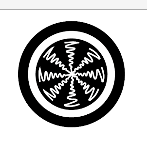
Starting with the image of the logo that was chosen for me (see below)
I first started off with just scanning the basic circular image onto illustrator and using the pen tool to vector the one length of the circle, which seemed to look ok but when I place them into the circle it looked over crowded and more like a patterned circle than vibrations.
Different variations of vectoring the circle and experimenting with black on white and white on black.
Out of this sheet, I felt that this was the strongest logo. However the sound waves still look more like 'zig-zag's and a pattern and not what I need them to be. Having the waves outlined by two circles also helps to frame it but I feel that it also may distract from the soundwaves.
Experimenting and trying to make less pointed/angular vectors
Using inspiration from one of the other music logos, I thought that the logo would look better if the waves were presented in block shapes, initially I felt that it worked but it started to look more and more like the logo from the TV series 'Lost'.
Even though I thought that the image looks smarter/more finished and even more like a finished logo, I still didn't feel that they were representing 'sound' very well.
Starting to add letterforms. I wanted a typeface that would mirror the circular form of the logo. When I placed the letters in the centre of the image, they did not stand out enough. This may have been because there were too many 'sound blocks' which I later reduced - however because of the block shapes I feel that they drowned out the type.
REWORKING THE IMAGE
Trying to make the shape look less computer constructed and more hand wrendered. I tried with a series of scans and photocopies of the basic shape and just drew over by hand then re-scanned it into the computer, then vector over it. Over all it does create a much better image, and I have increased the space between each of the segments.
Experiments with the format -------
Here I think that it is starting to look more like a logo/identity through the framing of the image however the lines are too thick and take the focus away from the centre.
LOGO DESIGN DEVELOPMENTS --------
I think that over the development there was a definite improvement of the design however I still wonder if there was enough variation between the first and the last design other than the background and framing it. I can go on to develop and change the logo later, but for now it is good.
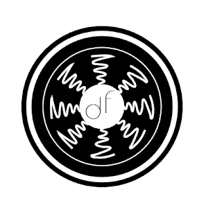
Here I started using the centre of the circle for development - by removing some of the blocks and then replacing that with my initial sound wave design - I thought that it would be a nice contrast. Overall I feel that the image looks better with a black background and white interior lines.
Here I had selected the image I wanted to work with and replaces the interior illustration with letter forms - the first letters of "Delux Flux"
BETTER LOGOS
Of all the logo developments I did, the few selected ones below I feel were the strongest.
Here there are just very small differences between the point size of the interior and circular lines.
This typeface definitely did not work, I initially thought that it might because of the circular format of the letterforms.
Playing around with the format of the letterforms and seeing if I could intergrate the "lux" of both words into one. However this did not work as I started reading it as 'DEFLUX.'


No comments:
Post a Comment