
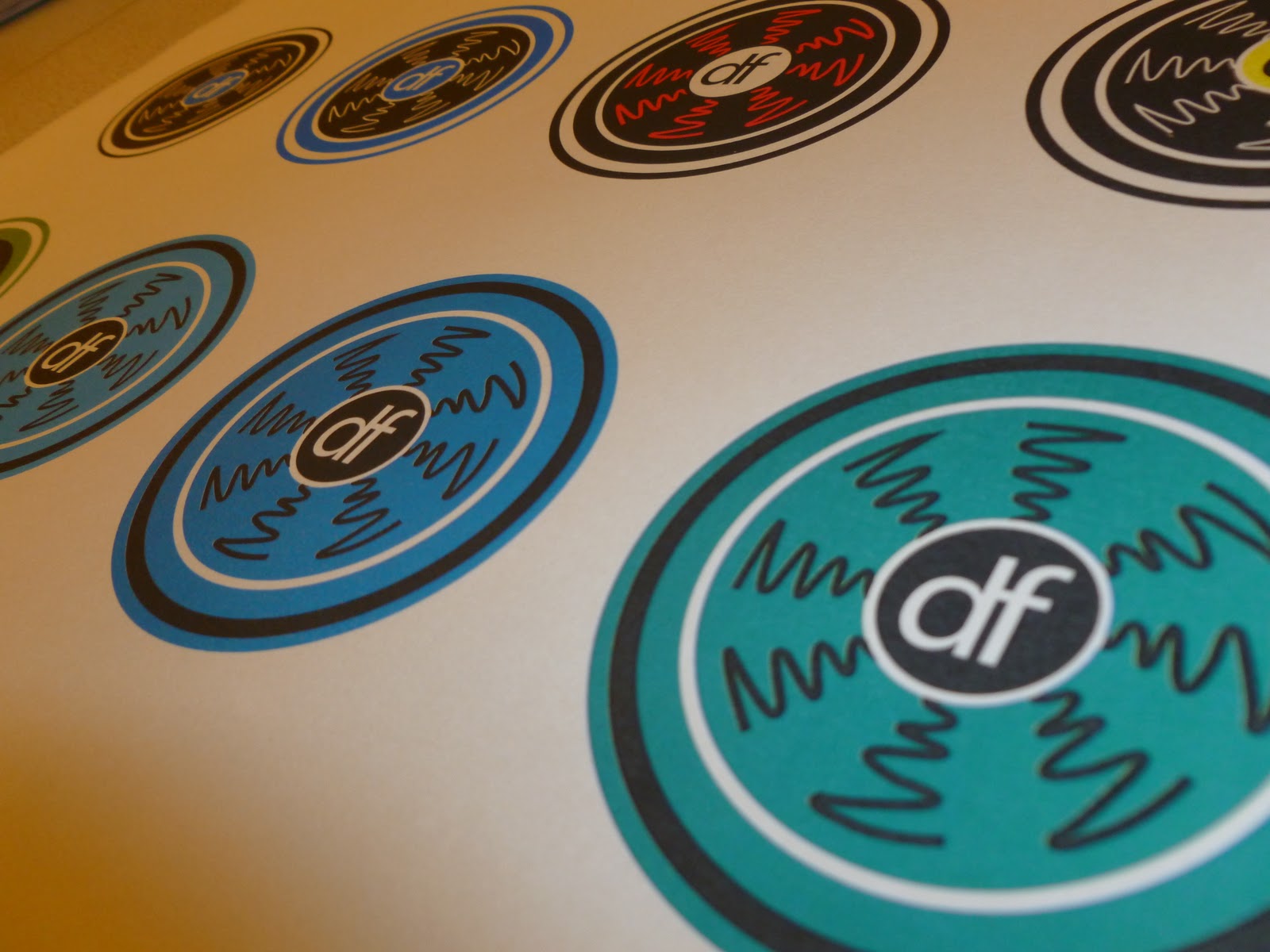
After designing the logos and all the variations in colour and point size, I had to see what each colour would look like when printed onto a different stock.
I wanted to use something different rather than white paper, so I found 4 different sheets and tested what they would look like. The dark cream came out the best, and unfortunately the dark blue didn't - I wanted it to work better as i thought it would make the pieces stand out.


No comments:
Post a Comment