
In photoshop you will either be working with scanned images or digital photographs.
RESOLUTION = 300 dpi for commercial print (72 pix/inch)
anything higher than this is used for larger pieces of work, if an image needs to be enlarged, you use the resolution to enlarge it (bigger scale, bigger resolution needed e.g. billboards)
if you printed out 300 and a higher one then you wouldn't be able to tell the difference
(2400-4000 dpi for larger scales)
always check that the colour is CMYK COLOUR (the defult colour mode is RGB)
When you open any image up on photoshop, there is in brackets along the top there written 'RGB". Can also see this by looking a the FILTER menu
IMAGE - you can convert the colour mode of the image - convert from RGB to CMYK - you can now see this in the title bar where it will say CMYK
If you then look in the FILTER menu again, a lot of the pervious options are now not available.
It is best for us to work in RBG when working in PHOTOSHOP...BUT there are colours we need for print that aren't available to print if we use RGB.
We can work in RGB while we are editing and preparing our images in PHOTOSHOP, but the LAST thing we do is to CONVERT to CMYK before we save and print it out.
(CMYK files are much larger than RGB files)


FOREGROUND/BACKGORUND COLOUR

The perentages go from 0-255


used in InDesign - better use of colours


Most of the design will be done in INDESIGN so we have to convert it from RGB to CMYK - the 100% green was out of range for CMYK, so it will change it to the nearest range of colour. The printed colour will not be what you expected it to be.

RBG

CMYK
HOW DO WE WORK SO WE DONT HAVE SUCH A DRAMATIC COLOUR CHANGE?
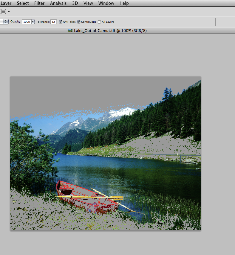
The image used on the exercise is typical of that which you would have used from a digital camera. You have probably made some adjustments with its Brightness & Contrast.
Notice it is opened up as RGB

VIEW - the GAMUT WARNING
You are now seeing the grey overlay which shows and obscures the colours of the image which are outside the printable colour range (CMYK), and those are the ones that will be shifted.
You can use this to check when you are adjusting the brightness and contrast of the image.
It is also useful if you want to bring these colours back into the colour range. You could just convert it back int oCMYK, but it could be that you want a little more control over the adjustment of the colours

One of the things that puts the colours outside the range is the HUE/SATURATION. As you decrease the saturation of the colours of the image you see the colours coming back from the grey parts.
Also look at the brightness/contrast as well to pull back the colours into the printable range.

DEALING WITH IT WITH MORE CONTROL
LAYER MASK - you could islolate certain parts of the image then work with certain areas
REPLACE COLOUR
gives you the MAGIC WAND and colour select tool at the same time.
Fuzzines - if you increase this, then more of the area will be selected
So then you can change the SATURATION of just the selected area


The GAMET WARNING isn't something you would want to work with on screen the whole time, just for when you are adjusting the colour.
PROOF COLOURS

The colours becomes slightly duller, it is very similar to when we perviously converted it from RGB to CMYK.
You can see this on the title bar of the image as well. It shows we are still working on a RGB image, but the preview we see is CMYK ( we cant see any NON printable colours)
This is something you CAN have turned on all the time.
CREATING COLOURS/SWATCHES
WINDOWS - swatches


If you select a swatch, it will change the FOREGROUND colour, which you can then apply to your image.
We can clear out the swatches pallet to make a SPECIFIC pallet and have something which is less cluttered and more relevant. (not as quick and easy as working in illustrator)
TO REMOVE - press ALT then click and remove it - the re-create your own pallet.
You can use the CMYK %'s, or just use the clicker.
Before you SELECT THE COLOUR - check the information to see if you can print it

In this case the colour is NOT available, so you can un click the TRIANGLE and it will convert it to the nearest colour.

You can either just let photoshop chose the nearest one, or you can scan with the mouse, the colours in the box until you find a colour where the yellow triangle does not appear.
Then click ADD TO SWATCHES

Also if you just click in the grey/empty area of your swatch pallet and click, you can just chose a colour from that and ADD to swatch pallet.
SPOT COLOURS
Used for ECONOMIC or BRANDING reasons. You can also get NON printable colours (flourecent), this can only be achieved using a spot colour
CLICK on foreground colour, then COLOUR LIBRARIES. You would then chose your swatch based on the TYPE of stock that you would be using. You would take advice from your PRINTER about this as well, it depends on what is available to print on.


Just like ILLUSTRATOR you can type in the PANTONE NUMBER - e.g. if your client gives you a certain colour number. You DONT see the numbers when you type them in, you just type and it will move to the particular swatch.
Click OK when you have the colour chosen, you now have that SPOT colour is now filling the FOREGROUND COLOUR
Now you can apply that colour to the image

Press ALT and DELETE buttons down and it will fill the space with the block of colour. \
Now the problem is that it is just a SQUARE of colour, one thing we NEED is a REFERENCE NUMBER, you need some way to get that reference number to have during the PRINT PROCESS, you can add this colour to SWATCH LIBRARY
You just click in the empty space of the swatch, and it will create a new swatch of the foreground colour (your spot colour)
WORKING WITH GREY-SCALE
We are going to SWAP the black ink for a SPOT colour, suitable for a one colour print job.
OPTIONS - MODE - DUOTONE
We have one ink (black), but this dialog box allows us to swap the ink for another colour, it lets us use a SPOT colour.
Click on the black square which will open up to the colour swatch scale box
You can also access the spot colour libraries through the button


You will now have the UNIQUE PANTONE REFERENCE number. The black ink has been replaced with the SPOT colour, DIRECT MAPPING


DUO-TONE CURVE
allows you to change the values
The bar along the bottom is the GREYSCALE bar

The boxes are the NEW COLOUR VALUES, the diagonal line shows where they hit, from left to right...10%, 20% etc, it just shows the the new ink is a LIKE FOR LIKE reference to the black ink.
(coming back to this later, not changing anything now)
In the TITLE BAR it is no longer RGB, it is monotone

IF you safe and put the photograph (save it as a photoshop document) then when you open it up in INDESIGN then the spot colour will become one of the colours on the swatch pallet.
MAKING IT DUO TONE
make sure you ACTIVATE it from monotone to duotone


MAPPING - you can then change the areas of different inks
You can add a point just by clicking on the line, if you want to remove it just hold and drag it to the top of the page.


2ND WAY TO APPLY SPOT COLOUR
This is about applying the spot colour to a selection
In the same pallet as the LAYERS, there is a CHANNEL pallet.
With a colour image there is a RED, GREEN AND BLUE CHANNEL, but with a monotone image there is only one channel.
The channels are about HOW the colours are going to be applied in the image. It is information about the way that colour is stored.


Channels can store information about selections> so if you are selecting part of an image, and you have taken a long time in creating the selection outline. You can save this selection in the CHANNELS pallet so that you don't lose it.
SELECT - SAVE SELECTION
what is WHITE is selected, what is BLACK is not selected.


CHANNELS - STORING INFO ON SPOT COLOURS
First select the part of your image.
Then go to the CHANNELS PALLET - there is the specific menu at the top right, then you have to click NEW SPOT CHANNEL


Chose the colour you want, you can also going into the swatch library and chose a spot colour, you have to have a reference.
The colour has been applied in such a way that the colour ink is going to OVERPRINT the black ink, this is something specific to this application
We now have 2 CHANNELS which has a specific pantone colour number


Because the information is held in the spot colour channel, you can select the channel and then modify
EDITING THE SPOT COLOUR CHANNEL
You can then use a brush, a soft brush to take away some of the colour etc


You can change the opacity of the SPOT COLOUR - if you double click the channel the colour window will come up and you just adjust/fill in the number of the SOLIDITY. The default is 0 because it is very easy to use without having to alter the image. It is also because with varnishes you want to be able to see through them.
REMEMBER THAT EVERY ADDITIONAL SPOT COLOUR IS AN EXTRA PRINTING PLATE, SO WILL ADD TO THE COST, THE MORE SPOT COLOUR YOU HAVE, THE MORE EXPENSIVE THE PRINTING WILL BE
If you wanted a GLOSS VARNISH OVERLAY - you would select the area you wanted it to have, you would USE THE SPOT COLOUR, and just say "don't print pantone number 12345, as that is where the gloss is meant to go, so instead of printing where the colour is, it will come out as a VARNISH"
LAST POINT TO REMEMBER
if you put a square of spot colour over the image in CMYK, (the picture is now going to be printed with 5 inks (CMYB and spot colour) so in the area with the new square of colour there are going to be a lot of ink there so you need to be aware of the INK LIMIT - the ink will turn black, the paper will get very black and the ink will smudge, it depends on the STOCK. It is useful to be aware of how much ink is going to be applied to the parts of the paper.
This will be carried on in the next seminar.
No comments:
Post a Comment