
MAC SEMINAR – INDESIGN
DOCUMENT – the most used format
BOOK – when your making a book, something which has hundreds of pages, divided up into chapter, INDESIGN will treat each chapter as a separate document – very advanced book layout –
LIBRARY – (similar to swatch pallet) number of books, collection of assets that you can access from other documents e.g. Illustrator. It could be a simple as images or other more complicated things.
PAGE SIZE – is the finished trimmed printed size of whatever you are going to make. If you are producing a business card (size informed by content) you make your page size the size of the finished trimmed business card. However big or small your work is going to be, makes sure it is the size you set up. Don’t have an A4 sheet then design the business card in the centre of it.
MARGINS – part of the guide of the page – you can chose to use these if they will be useful and assist you in your layout. If it is going to be useful to have margins to have constant white space, then you can alter the size. They are at a set default value when you open the document. These do not have any effect on the finished document (when you set them…you can alter them)
BLEEDING & SLUG – always specify this. Avoiding white edges around your print. It is to do with the trimming process. Everything is going to be printed on something which is larger than your print size so will need to be trims. Very important that anything you want to print will extend over the line. If you have a page which has a full page photograph edge to edge, when you lay out that image has to go over each edge of the page so when it is trimmed, if the page isn’t exactly lined up with the scalpel, the fact that the image extends over the page gives you some tolerance and you wont see a white line at the edge of the image. Bleed margin puts a margin outside your page so you can extend these over the page at a require amount. Standard is 3mm; whatever you are laying you you should always include a bleed margin even if the design doesn’t require anything to go over the page.
FACING PAGES TICK BOX – it is weather or not you work in a spread…is what you are producing going to be a book? If you are working on anything that is going to finish as a book then facing pages will aid you.
SCREEN SHOTS………..
The black line is the edge of the page, red margin is the bleed guide – this is where you should extend photographs to.
SCREENSHOT…………..
‘W’ – press this, short cut to print preview


APPLE-SFT-C = CENTRED TEXT
APPLE -SHFT -R = RIGHT TEXT
APPLE SHIFT-L = LEFT TEXT


To apply colour to object to the page it is the same as illustrator
Red squares at the top of the swatch pallet for stroke and fill

SHORTCUT TO SWITCH STROKE FROM FILL - PRESS 'X'
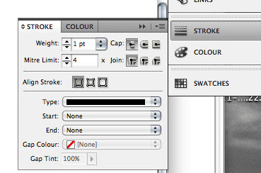
Increse the weight of the stroke via the menu
Filling the text box with colour - buttons - background or text - click the T and the colour will be applied to the text. This will apply the colour to every bit of text in that frame


CHANGE SWATCH PALLET - to have specific
Similar to Illustrator - click the arrows on the swatch pallet and click on to 'NEW COLOUR SWATCH'
It then comes up with sliders where you can mix your inks - made up of CMYK %'s.


One thing in illustrator we had to do was to chose weather it was GLOBAL or not - but in in-desgn all the new colours on the new swatch will be GLOBAL and have the GREY SQUARE icon.
It saves time - it will change all the colours of any time you have used the colour in the whole piece, wherever you have changed the colour it will do it to all the other places you have used the colour.
As in illustrator it was the only way we could make TINTS of a CMYK colour - it is very easy to add tints of it.
In Indesign - you can select a swatch then go to the options and it gives you the option to make a new tint of the swatch. You cant change the ink mixer but you have a slider to change the tint and just like in illustrator it will have a % after the its name


QUICK VIEW TINT BUTTON


CREATING SPOT COLOURS
Go to swatch menu and add new swatch then go to the open


You can just type in the reference number which you have been given by the client - you should automatically see the colour changed to spot via the colour choice - better not to change it yourself. Look for the CIRCLE icon in the box - you can set up TINTS of that swatch colour in exactly the same way.


THINGS TO MAKE SURE OF BEFORE YOU PRINT
PREPARING IMAGES - PHOTOSHOP
COLOUR - doesn't matter what type or content but you have to make sure of the colour mode, that it is CMYK, look at the gamma warning and the CMYK preview.
It could be GREYSCALE /MONOTONE/DUOTONE.
RESOLUTION - make sure that the images are 300 dpi
ACTUAL SIZE - created at its actual size - the image needs to be prepared on photoshop before to the size you want it on the document. When you place it it should be already the right size, otherwise it would make it PIXILATED as you will be decreasing the dots per inch, you are lowering the resolution.
FORMAT - save as TIFF, PSD (photoshop fils), PDF, don't use a JPEG because they are compressed file, the image quality is lower. Small files which are suitable for webpages and emails but NOT for print. When you would use a PSD over a TIFF file, is when you are working with an image that has transparent parts then these will be maintained, but TIFF files do not maintain the transparencies.
PREPARING IMAGES - ILLUSTRATOR
COLOUR MODE - when you make a new document you can select the colour mode but make sure that it is CMYK and that the individual colours are not RGB.
RESOLUTION - you don't have to worry about this because it is not made out of pixels
SIZE - you can scale images etc in illustrator so you don't have to start the document at the size you want.
FORMAT - you can just save it as an Illustrator five - (AI)
There are fewer limitations when using illustrator, but it is the type of work that you are creating which will determine what program you use.
IMAGES IN INDESIGN
small square of the image will appear because there is no frame set up
PHOTOSHOP IMAGE - Duotone image - the 2 spot colours that have been applied in photoshop have now been added to you are swatch pallet.


ILLUSTRATOR ARTWORK
Place image - then the 2 colours from the image have also been added to the swatch pallet - this is useful for later on during the print process.

Anything that is not arwork is transparent. This happens by default but you do also have the option to how it works

When you FIlE-PLACE and image, you can click the box where it


Depends on the type of file you are placing then you will need to have a look at these options - click the TRANSPARENT background box, and it will come up as just the image.
The quality of it is low, it looks pixilated - it is to save space to make indeisgn run smoothly - can happen with photoshop files but it is more noticable with illustrator files
It is a low resolution preview. When you place a file onto an indeign page we dont include the image in the indesign file, it doesnt become part of the indesign file, when you place the image you establish a link between the image and the file, its only purpose is to position the image on the page relevant to the other elements on the page.

The placing of image is demonstrated by the LINKS pallet

Keep all your images in one file - this means that all the images you place into the program are in the same place. DONT throw the image away, if you do you can still see the image on screen but it will turn out pixilated - so keep the files but if you keep the files it will turn out just how it looks in illustrator. Losing images results in low resolution, poor quality or maybe not even the images printing at all.
This ADVANTAGES of this means the indesign file remains small and easy to work with, you can move things around on the page.
Also because you have a link between the image and the link on the page means you can place and edit this - and what you have on the page will update. You can still make changes to the image and it will update on the INDESIGN image. You can also do this through Photoshop.
SHORTCUT - if you right click (CONTROL CLICK) then you have an option to EDIT ORIGINAL
OR you can click hold the ALT key then DOUBLE CLICK on the image, it will automatically open the program the image was created in.
Make the change then click SAVE then when you go back to INDESIGN the image will have been updated


IF it hasnt updated then you go to the links pallet, and if there is a yellow mark in the green circle then you DOULBLE click this and force it to update

You can also do this with PHOTOSHOP and TIFF files
Go back to where the images are stored in the folder, get info and check where it is going to be opened with - change it from PREVIEW to PHOTOSHOP then click the CHANGE ALL button then this will do this for all the tiff files. This will stay like this for the rest of the year and is something that is unique to your home file.


WORKING TO LIMITATIONS OF 1 COLOUR PRINT JOB/1 SPOT COLOUR
One option is to make a MONOTONE image. You can do something similar to the PHOTOSHOP seminar last week.
It is now possible to apply colour to the image while it is in INDESIGn,

Click the TWO CIRCLES in the centre of the image - you can then just select the spot colour and it will be printed with that spot colour - it means that if you want to change the colour that is applied, you can do it all in INDESGN rather than just jumping back to photoshop.


CHECKING IS GOING TO WORK AFTER YOU SEND IT OFF...?
The image has CMYK and 1 spot colour

COLOUR SEPARATIONS
We need to look at what is going to happen when we sent the file off to be printed.
FILE - PRINT- OUTPUT
When you get something out of a printer it is called COMPOSITE PRINT - it is what you see on screen
During hte commercial print process, the indeisgn file is printed but a composite isn't generated. The file is separated (colour separations are produced) - similar to channels in photoshop. The commercial print process involves the printing of colour seperations, each one is a black and white image that will define where each one of our inks are produced

From this you can change the type of file that is going to be printed. Chose the SEPERATIONS button


During the COMMERCIAL print process, they are printed on to ASATATE sheets and this will make the different ink trays ( similar to screen printed). This process can be used to set up screen printing, you print each of the sheets out per colour and then make the differnt screens.
This is what would happen in the PRE PRESS department in the printers. If you clicked then you would get 5 black and white images.
There is a way that we can see that it is going to seperate and print properly - same way you get a print preview.


Click on the swatches and you can see the colour seperations


IN the previous image - you now have the opportunity to see the colour separations for each of the spot colours. One consequence of this is that if whoever is working int he pre press department, is it up to them to go through the layout and check if the spot colours haven't been used. It would then print 9 different separations, they may not make different plates but you may get charged for the extra printing. So CHECK AND DELETE any UNUSED spot colours (ones that you have been experimenting with or not using any more.

CLEAN UP as you go along. Delete the SPOT colour from the main swatch menu
SPOT COLOURS INTERACTING DURING PRINT PROCESS


KNOCKING OUT - the magenta has KNOCKED the cyan - this prevents other colours being make from printing colours over each other. The colours also depend on the paper it is being printed on. In order to produce the colour it has to be printed directly onto the paper instead of another colour. This is the DEFAULT setting for spot colour. The only colour this doesn't do this with is BLACK - it doesn't rely on the paper to make it black so will OVERPRINT
You can have some control weather the ink KNOCK OUTS or weather it OVERPRINTS

Turn on SEPERATIONS PREVEW ON or go to the VIEW menu and select OVER PRINT PREVIEW

If you change the OVERPRINT settings, (wont see it if you print to a laser printer) - it is more to do with the commercial print process, if you decide to do this then you ALWAYS have to TALK TO THE PRINTER before you print it because there may be problems, there may be too much in applied - in the centre it will give a 300% of ink
INK LIMIT
the lighter the shade of grey, then its ok, but if it is red then you can see the problem are. you can change the % of ink. you can change it BUT DONT DO IT WITHOUT CONSULTATION


PRINT FINISHING
Things that can be applied to the paper that aren't ink. You can do this by using SPOT COLOURS. If you are printing on a matt stock and want a spot varnish to appear then use a spot colour that you HAVENT use anywhere else in your layout - you can then get a separation printed but you would tell the printer NOT to use that SPOT colour, and instead to use a plate that was going to apply a gloss varnish.
You cant just use a spot colour otherwise it will KNOCK OUT all the other colours, this will not work for a varnish as you want the colour to show through.
This you would SELECT the text and specify that it would OVERPRINT. (shows as slightly transparent).
You can also see that a lot of ink is going to be applied but it wont be an issue because the ink should be dry by the time the varnish is being placed on.
You can do the same thing for NETS for packaging, if you designed your own, then you can use a spot colour to show a special cut area, then use a spot colour and talk to the printer to get it cut there.
No comments:
Post a Comment