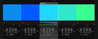
Im a bit unsure of what colour scheme I should use for the packaging as I originally wanted to use pastel colours however the rest of the body shop products are bright bold colours, so I had a look on Kuler to see if there were any swatches that were appropriate.
Cool going to warm colours, something I could start off with.
I saved this one just because of the bright colours and trying to keep in with the other body shop products.
I still want to keep in the neutral (green) and cool (blue) colour scheme and this is one that I feel is appropriate to begin with as well as the swatch below.
Slightly muted tones of green - these are not very appealing to use for initial packaging designs but later on if I feel there is something missing from the designs I may chose to look back at this swatch
A skin tone range that I could possibly use for the foundation packaging
This colour scheme is too bright for the style of packaging that I want to produce


No comments:
Post a Comment