When looking for visual stimulus one of the main theme is faces - so maybe placing the quotes in colour circles/shapes could is an idea.
Before I went looking for colours which represent optimism and pessimism I though about which colours for me best represent and I came up with YELLOW for optimism because it is bright/light and associated with the sun/sunrise. Then I chose blue because of it being both a calm but yet depressing colour (rain is blue in cartoons). I then found this image which showed that the colours I chose worked
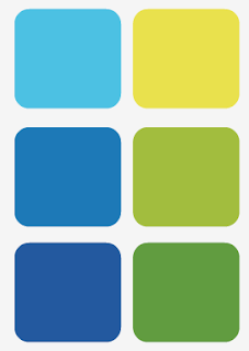
These are the colours/tones which I have taken from the image above and will be my starting point.
I have done some other experiments with colour but I don't think they work as well


No comments:
Post a Comment