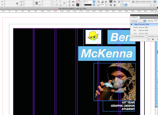
Using Indesign was very challenging for me having never used it before and I was away from college when the Indesign workshops were going on. So using the help of online tutorial and a book I brought I am slowly learning and how to use the program.
At first I took one of his illustrations and wanted to make this the main focus of the page however this didn't really work.
Basing the logo form the invertivew - Using blue/his favourite colour.
Origionally I wanted to use the typeface 5-cent for his name as as it was in a grafitti stlye however it wasnt very legible
FINAL PIECE
After looking a the different colours for the backgrounds - even though I think that the bright turquoise works quite well, I feel that the black background looks smarter, so instead I have placed a turquoise outline to the background.


No comments:
Post a Comment