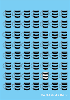
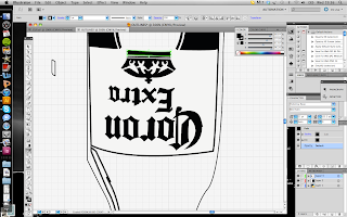
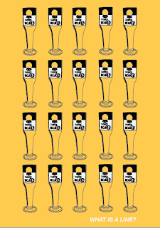
Moving on from my photoshop experiments. Here I have taken photographs of single objects around the house and create a pattern/collection of the object.
I thought that replicating the posters but changing the colouring slightly looked quite good.
Using the colour of beer!
The outline of a simple wine glass then using the colour of red wine instead of white because it would be too similar to the beer picture.
I chose to use green for the last colour, it goes with both the two other colour posters. This time I changed the outline of the wine bottle to white to make ti stand out. For the final poster I think is the best of the 4 posters, it is clean, crisp and smart. I am pleased with the way it has turned out


No comments:
Post a Comment