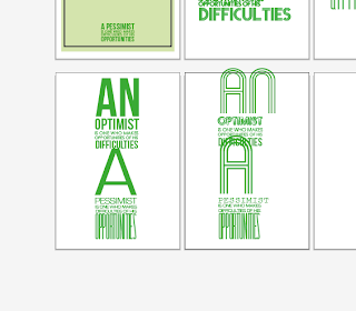
Or I could use a statement which talks about both optimism and pessimism and experiment with ways of presenting that. I do want the poster to be different form the other two - to stand out slightly
Here are some more quotes which combine both optimism and pessimism
The pessimist complains about the wind; the optimist expects it to change; the realist adjusts the sails
When everything’s coming your way, you’re in the wrong lane.
The pessimist sees difficulty in every opportunity. The optimist sees the opportunity in every difficulty.
No one ever says “It’s only a game” when their team is winning.
POSTER EXPERIMENTS
I have chosen to use green because it is a mid way colour for me, its natural and relates to both
TRYING A DIFFERENT ARRANGEMENT
I think the left collection is the strongest but I am still not happy with the middle and top typeface for the 'A'
I think the right hand arrangement is the most successful.
Experimenting with all the different shades and combination of colours and sticking to my ORIGIONAL idea of using shades of yellow and blue - this is the final result which I am pleased with.


No comments:
Post a Comment