
GIFT CARDS - Looking at all the different areas that I can design for print for. If I was going to send these off to be professionally printed I would want them to be on plastic.
I am going to create a range - similar to vouchers where there is a range of £5, £10, £15, £20 etc - but I am going to create it for
- Free Playlists - comes in the package when the product is purchased
- 1 playlists - pink
- 2 Playlists - blue
- 3 Playlists - green
- 4 Playlists - yellow
- 5 Playlists - orange
The idea is that these gift cards can be purchased in any music store just like any other gift cards for birthday or christmas presents.
I want them to be the size of a normal credit card so that they can fit into anyones wallet.
Keeping the cards simple - just like the other gift vouchers I have come accross, the first set of designs I have done just place the logo on the front
Some of the information that I need to include on the front is
- logo
- brand name
- state that it is a gift card
- Voucher worth e.g. 2 playlists.


Although I have got the typeface for the logo sorted - I needed another typeface for the 'gift card' and the '1 playlist'. Above is the few that I selected and tested out, and the screen shots below are the few that I have condensed the selection down to.

This is very similar to the typeface of the Mark & Spenser and the Topshop gift voucher gift card. I chose it because I thought it made a nice contrast to the heavy weight of the helvetica letterforms.


This is quite similar to the helvetica of the logo but I still think that it works quite well.


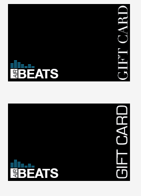
Still keeping the format of the gift card simple, I just wanted to have a look at what the new typeface of the 'gift card' looks like when placed with the logo as well as looking at the different sizes and layout of the card itself.


I dont think that the vertical way of writing the type works - if anything it works better having the type vertically aligned and horizontally written like the image above.


The top image of these two is the typeface that I thought that looked similar to the logo. My idea of choosing a typeface that was opposite to the logo has slightly fallen through as I feel that this looks better than the lighter styled 'gift card'.


Trying to work some simple imagery design into the gift card. I like the circles however I don't think they work very well on this card, they don't take up enough of the space on the card and don't work with the logo.

Experimenting with having the basis of the gift card the colour of the number of playlists e.g. 1 playlists is pink. This way they could be easily identifiable.


Trying out imagery - simple and using 3 different tints of it. I think it works quite well although I still feel that there is something missing or than the imagery doesn't work as well as I thought it would.

Using the imagery on a black background makes it look much better. I am not happy with the position of the logo, but because of the beat vibration image - it does not look good if I place it in a top corner.


BACK OF THE GIFT CARD
Things that I needed to include to make it look like gift cards you can purchase;
- 16 digit card number
- Pin number
- website
- terms and conditions
- logo


The format of the rest of the gift cards is a rectangle with pointed corners, however when looking at the other gift cards, they all have curved edges and when creating the back of the gift card it does look much better with curved edges.
NEW FACE TO THE GIFT CARDS
I don't think that the designs I have done for the gift cards were hugely successfull. Now I have just been focussing on keeping the card simple and easily identifyable as being part of AIR BEATS and the number of playlists the card gives.

Here I think the top card looks ok, the middle is too minimlalistic and not very interesting, and the bottom card is too complicated and I shouldn't use the image that I have used in the logo again.

I think that the top logo is the more successful out of all so far, the other two below it don't work as they are also too simplistic and boring.

After asking some people on their thoughts and opinions about the cards - a few of them felt that the cards above weren't very exiting in terms of the design and they felt that I should include some form of imagery.


Placing all the information on the cards - the layout doesn't work with any of them - even with a lighter tint of pink behind the main strip.

Here I can see that by using the image it has given a much more intersting affect to the card. It looks much better. I am also using the idea of having the strips of colour to signify the card number playlist but having them vertical instead to not to overpower the card too much.

These cards are more successful however I think I need to work out a better place for the 'gift card' and '1 playlsits', maybe have the '1 playlist' where the gift card is...and move the 'gift card'.
No comments:
Post a Comment