

These logos above are the ones that I have chosen from the last selection. Interstingly enough they are all blue / green. I think that best from these selection is the second to top and the bottom logo. Both use bright blue - this is something I will take forward and develop the logo...the colour scheme of white black and bright blue. It gives the logo and electric feel.
CHANGING THE LOGO
Although I like the typeface of the previous logo - in the crit it was said that it was slightly too complicated. I think that looking back that this was the problem with the logo, so I have chosen a similar but fuller typeface and working with the colour scheme.


I think that this blue one looks really good, it stands out and the type works really well.

Looking at different colour versions of the logo. In the middle logo I am still trying to integrate the original logo. I also think that it is starting to look more like it is representing something to do with music.

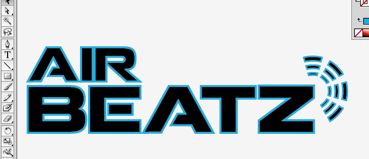


Given the logo a neon effect with the blue line on the outside. I was really happy with this logo but then there were still mixed opinions when I asked some people for feedback.


This logo I think works really well, although I need to integrate some form of colour in the brand.


This is the logo that I am going to use. It fits together well and needs a square outline which also reflects the sharp points in the shape of the typeface.

No comments:
Post a Comment