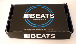
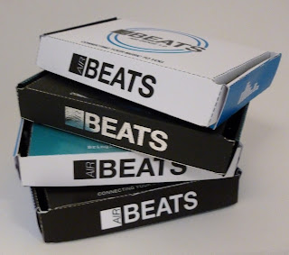
For the final packaging I decided to keep the original blue gradient design, create white, black and a foil stamped version of the net. I felt that the range of the packaging wasn't complete without the blue package. I am pleased with how they have come out and they all look smart and I feel that they would stand out in a music / technology shop such as HMV. I am most pleased with the foil stamped net, I think that it gives the design an extra edge and the shine of the foil will attract peoples attention and make them want to pick the package up, hence a more successful design.
I would have liked the logo on the foil stamp package to also have been embossed and for the other 3 packaging designs, I would use a UV spot varnish for the logo, to give the design an better quality finish.
For the foil package, I used the silver for the top / lid and sides, and for the bottom part and sides I used the ice blue, hence incorporating all of the colours.


No comments:
Post a Comment