
Below are a series of some of the designs I experimented with for type. Some of which I designed to go on black stock, however after testing out what a packaging would look like on black stock and finding that it didn't work how I wanted to, I have decided to print all the nets onto white card, apart from the foil stamped packaging.
For the final nets they all have the same basic layout, it is just different parts of the packaging are different colours / gradients.

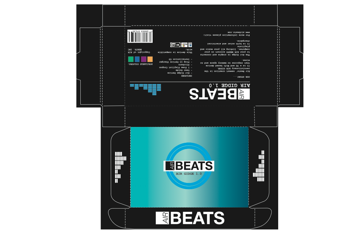
This is the black net that I am going to use

This is the net for the foil stamped.

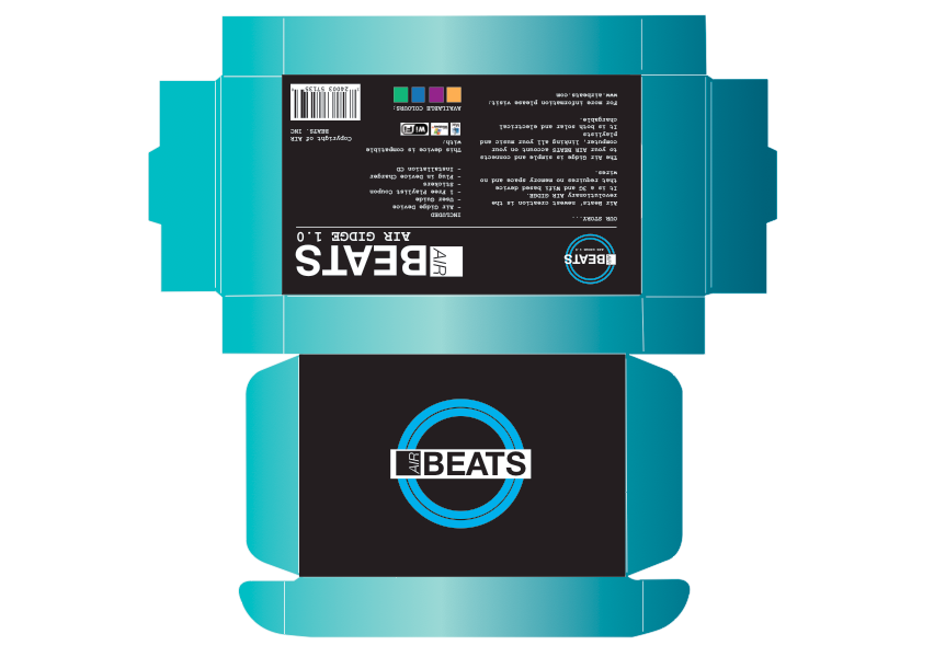
This is one of my original nets that I thought I was going to use, just to test out the different gradients, however after printing out I didn't feel that it fit with the rest of the packages.
The main gradients

The basic white net - this is the net of the package which people felt from the crit was the better one.


This is the design that is going to be printed on the inside of each of the packages.


A simple packaging design with no colour.


Using the other developed logo in a white circle. This was one of the designs that I started with. I feel that the filled white circle logo is better than the outline of the white logo (below)


Just experimenting with different colours, but then I felt that it wouldn't' fit with the rest of the designs and that it was better to stick with the blue white and black colour scheme.

Having the main body of the net as the gradient and the top and bottom of the net as black. I think that it looks better on the net that it would do printed out because I want to keep the top face of the package to be the most striking part of the package rather than the edges.

No comments:
Post a Comment