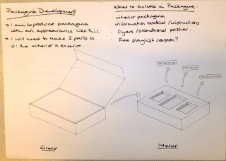
Having looked more at the packaging of other technology such as mobile phones, I think that a smarter piece of packaging is a stock with a high gsm with a net similar to the layout of the box below.
Instead of just having the product placed inside, I am want to design the interior of the packaging so that the information booklet and anything else I chose to place in there are clearly displayed.
The bottom packaging here I think because of it slightly unusual shape will help attract more attention - however I don't feel that it will be a good shape for the product in displaying it.


No comments:
Post a Comment